


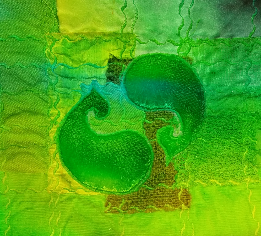
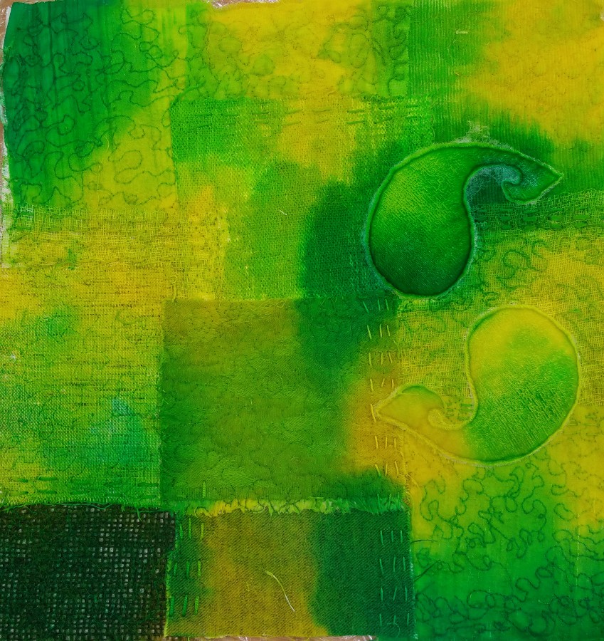
 I had a delightful day this week, teaching a textile art workshop to the West Sussex-based Tamarisk Textiles group. What a lovely group to work with – experienced and enthusiastic, and very focussed. The day was based on applique cut-away quilting technique, combined with Procion dyeing (see green sample here). This colour range seemed to catch people’s interest, and about six people chose to work with the combination of very acidic lemon yellow and turquoise, giving a range of greens. I’ll probably add some contrasting stitching to this sample later – maybe in a really different colour like orange or fuschia, or maybe in the darker shades of green already in the piece.
 Cut-away applique is as old as the hills, and has been used in many different ways by so many different cultures and embroidery traditions ranging from India to Panama. On the left is a photo of a piece I made donkeys years ago, using cut-away applique (I’ve shown it here before, I forget why). The padded top layer is dyed viscose velvet and the bottom layer is a ‘sandwich’ of different fabrics and threads. Stitching goes through all the layers and is then cut away leaving the top one standing proud of the background. The difference with this one is that I dyed the fabric first, which is why the greens and reds haven’t bled into each other. I did it that way because I didn’t want to blend them and end up with brown. For the blending approach, it’s important to like the colour that you get when your chosen colours bleed into each other.
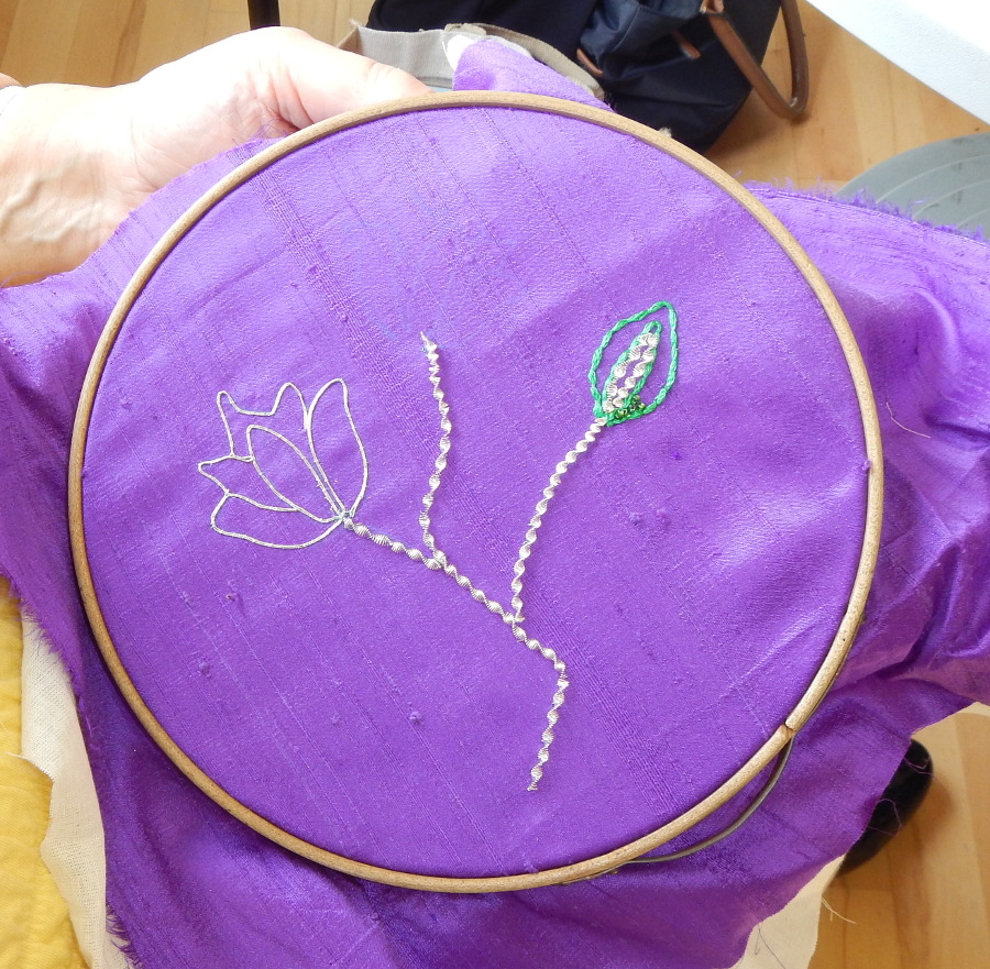
At this week’s workshop everything was stitched in white on white, and then dyed at the end. The idea is that the dyes will ‘bleed’ across the different fabrics and react differently with each one. The background is built up with pieced and patched bits of un-dyed fabrics with different textures, which is held in place with decorative stitching in undyed thread. It is all dyed at the end.
 I think I’ll re-dye this yellow and turquoise one, as the turquoise would be better darker – I think it looks abit ‘weak’. The other issue with this one is that a slight bondaweb sheen can be seen through the strip of dyed lace, so I think that would be better hand-stitched into place instead.
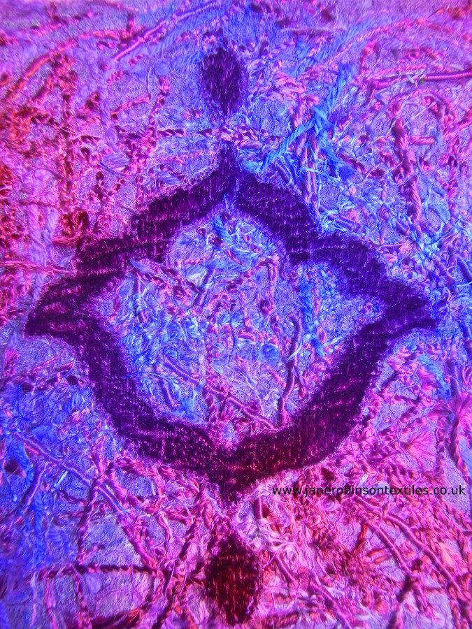
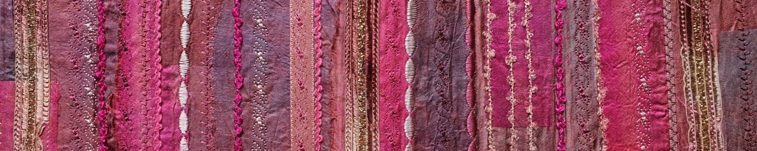
This purple one was made in a slightly different way. Rather than applying bits of fabric, I layered lots of snippets of thread across a backing fabric, on a layer of bondaweb, and then stitched them down with machine vermicelli free-stitching. I’m not entirely convinced by this one because there’s a slight sheen coming through from the bondaweb (it doesn’t show in the photo and other people say it’s OK, but it annoys me). Deeper layers of threads would solve that, but then they slither around while you stitch over them. This was dyed with turquise and fuschia pink. I haven’t photographed the orange and fuschia pink piece that I made as a demonstration in class as I haven’t rinsed it out yet.
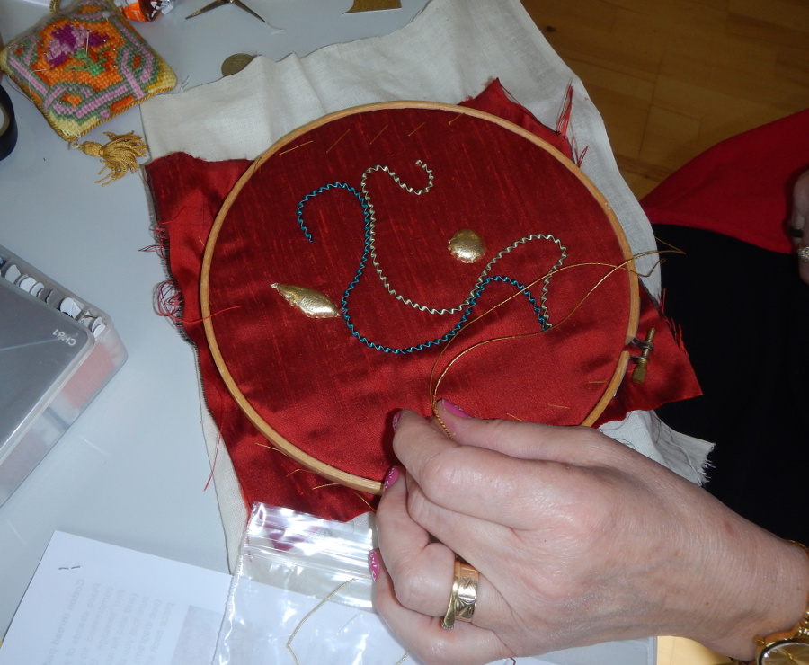
Some hand-stitching gives a good contrast to the machine vermicelli stitch (student’s work).
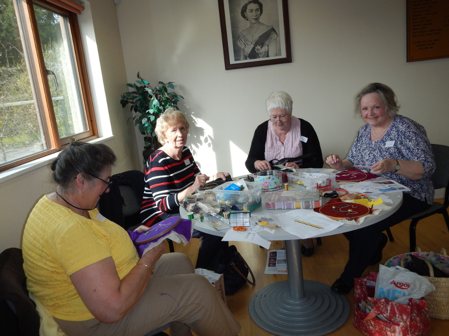
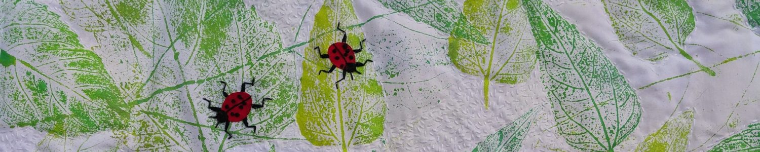
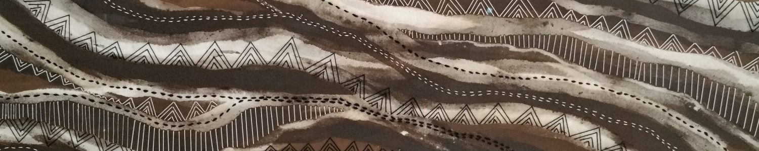
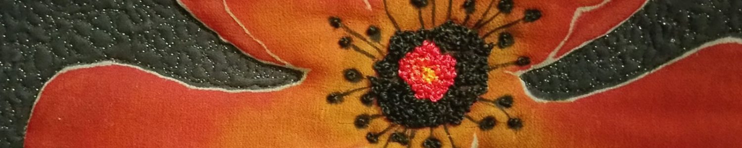
The group produced some lovely work. It was quite a tall order to create the backgrounds, stitch them, apply the padded and raised motifs and get it dyed, all in one day. It could only be done with an experienced group. Some people used my Indian motifs and others created their own. I’m really annoyed with myself for not taking photos of work in progress, and I only remembered to take photos after most of the pieces were packed away. As a result I’ve only got pictures of six pieces of work from the day instead of all 15, but they give an idea of the range of work. I’d be pleased to see some photos of some of the finished pieces when they’re dried and rinsed out. Scroll down for some of the work produced in the workshop.
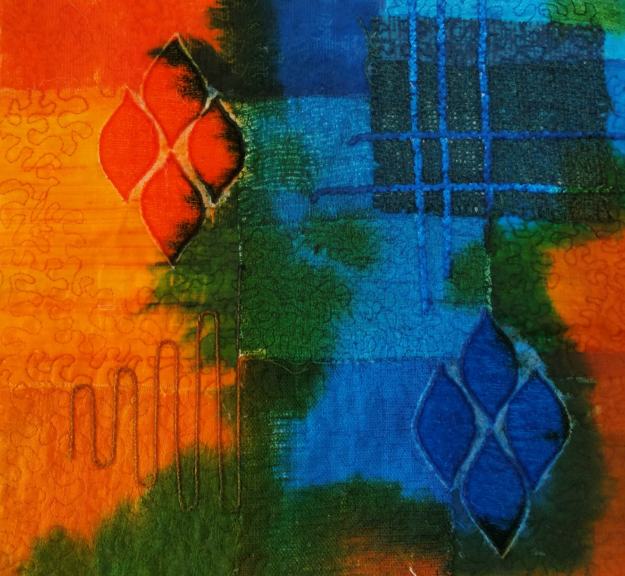
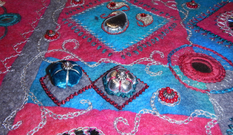
Nice use of the repeated motif, and some surface couching that took the dye well (student’s work)
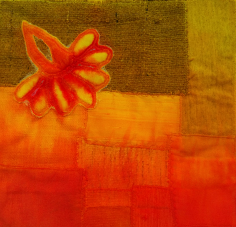
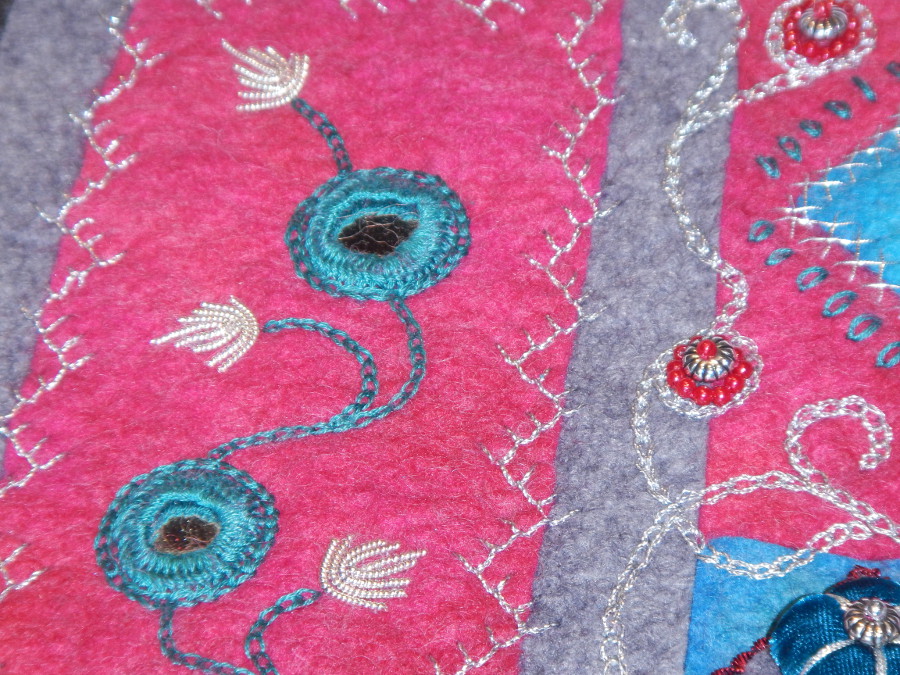
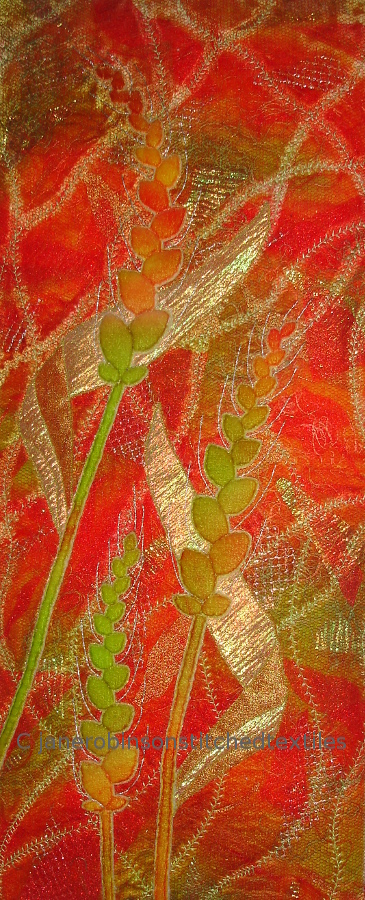
Some nice colour bleeding in the bottom half, where the red has been given freedom to find it’s own way into the yellow. (student’s work).
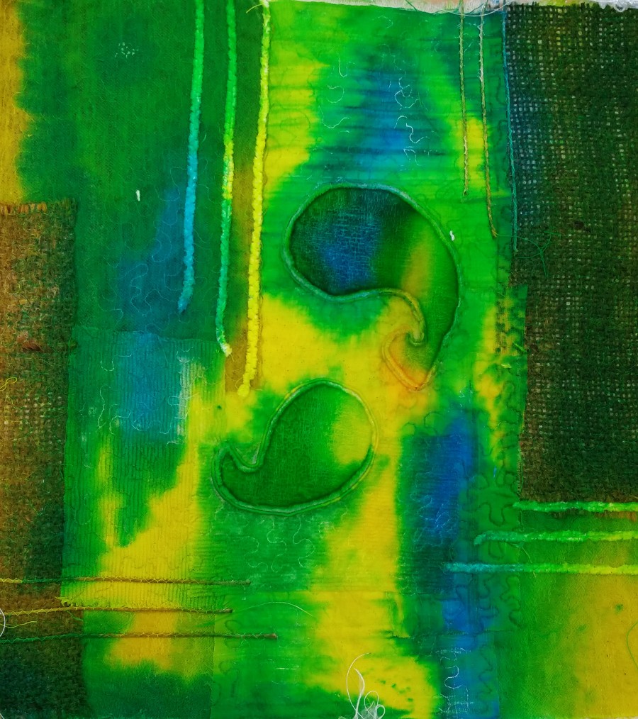
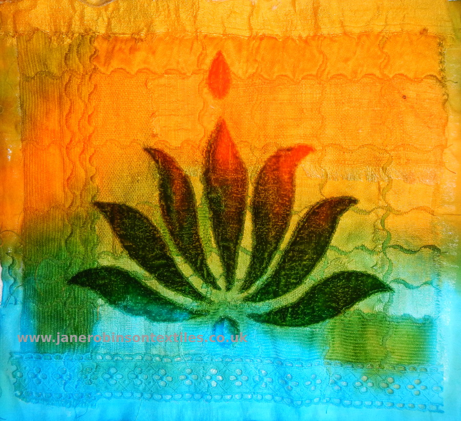
I like the way the colours blend and bleed across the motifs in this one (student’s work)
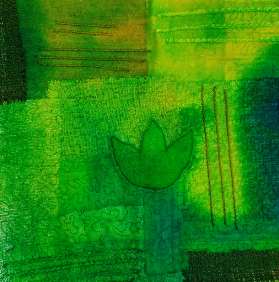
Some subtle colour mixing in this one (student’s work).