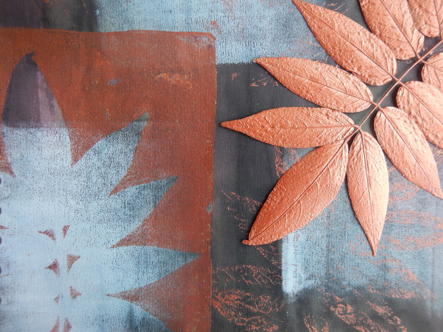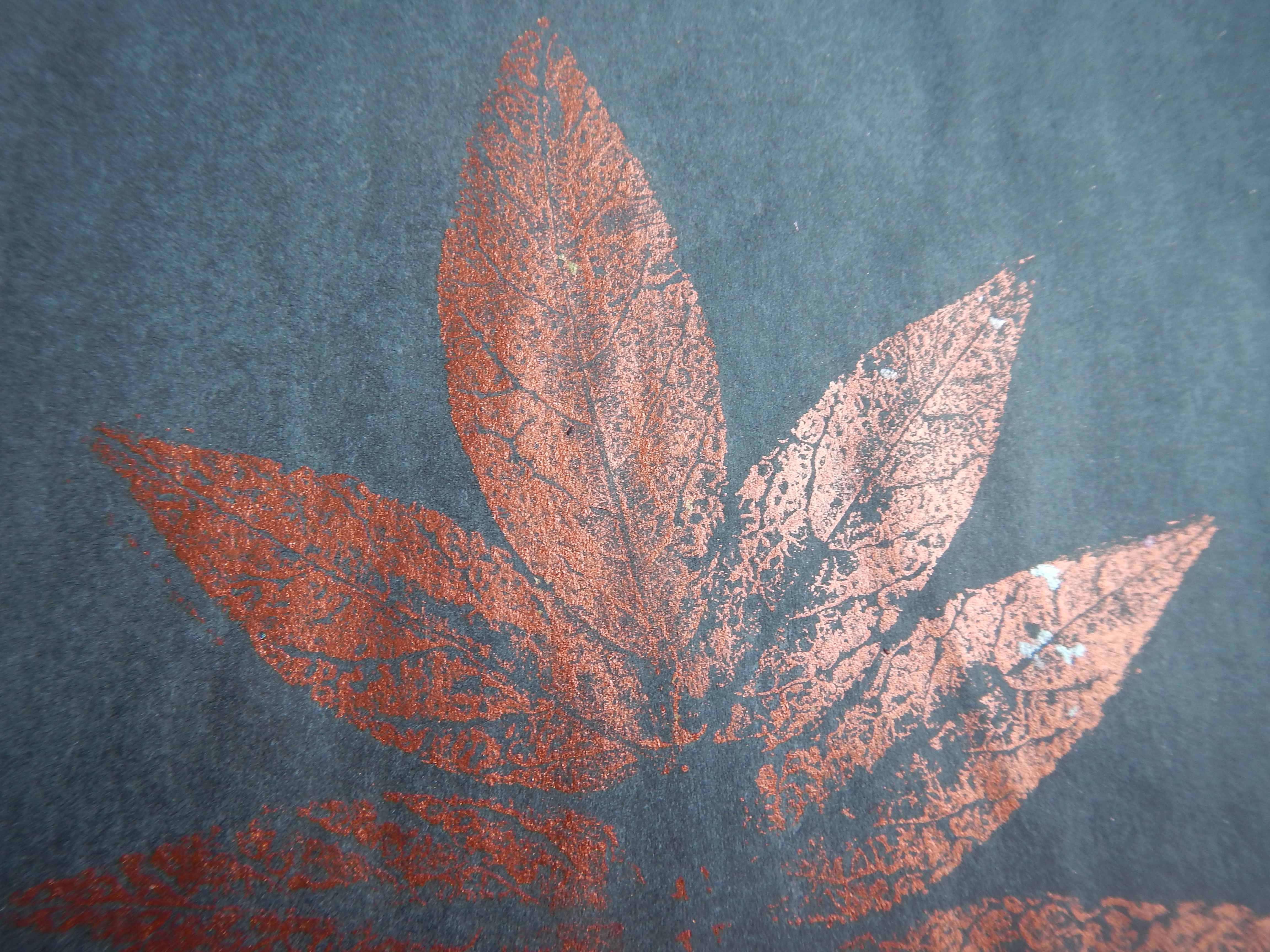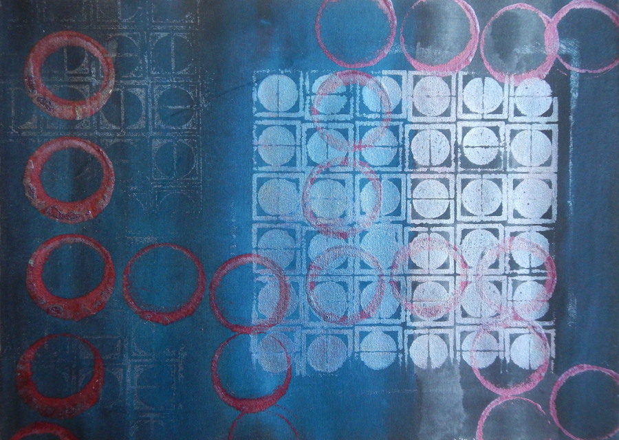


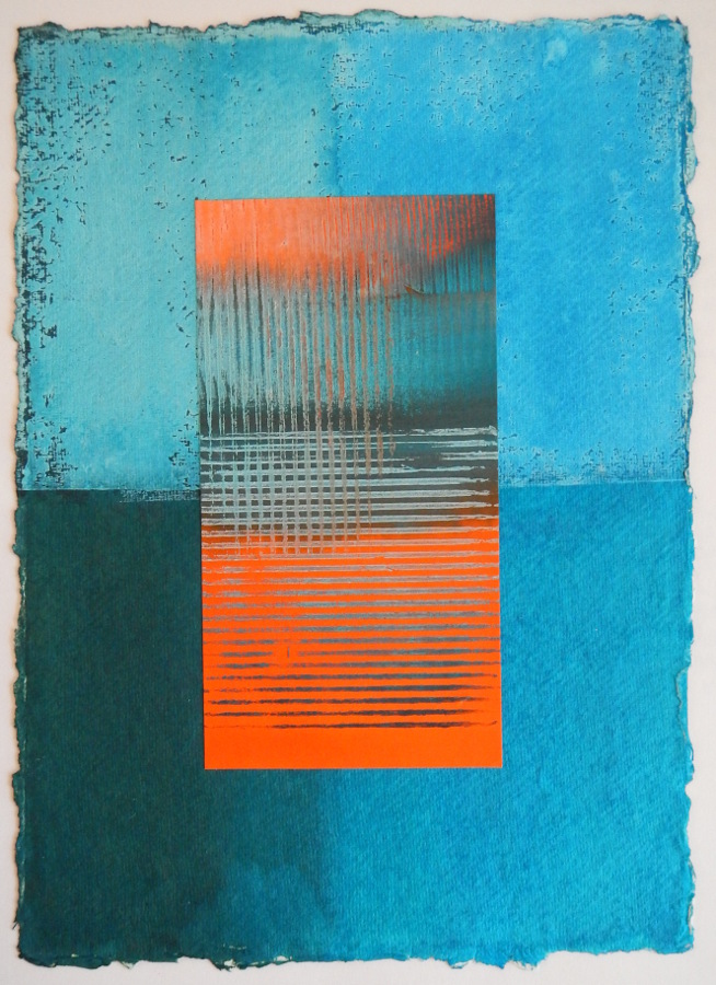
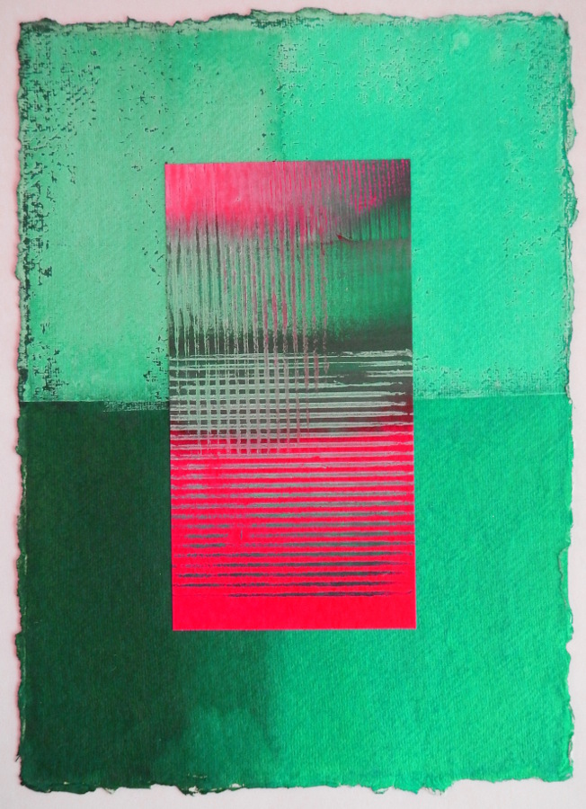
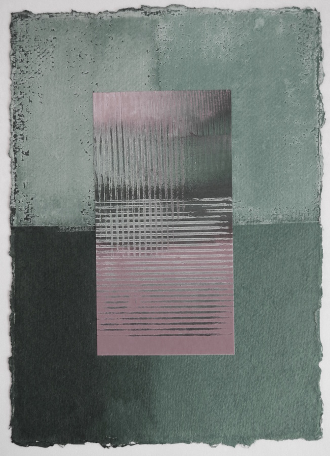
 I’ve been playing with colour lately, experimenting with changing the levels of colour saturation. I started with this simple print that I did some time ago. The background is khadi paper which firstly had a layer of gesso rolled over one half. It was then coloured with turquoise Procion dye, and some areas had a hint of black added to the turquoise. On top of that is a simple mono-print in turquoise acrylic paint with white or black added, on an orange and turquoise background. What I was experimenting with in this piece was seeing how colours recede or move forward depending on contrasts in their position on the colour wheel and the degree of colour saturation. I’ve often admired the subtlety of other peoples work when they use delicate and complex colours, as I often tend to go for very bright, strongly saturated colour. So what I’m playing with at the moment is changing the level of colour saturation, and the levels of white and black mixed with the pure colour, to see how that changes the overall effect.
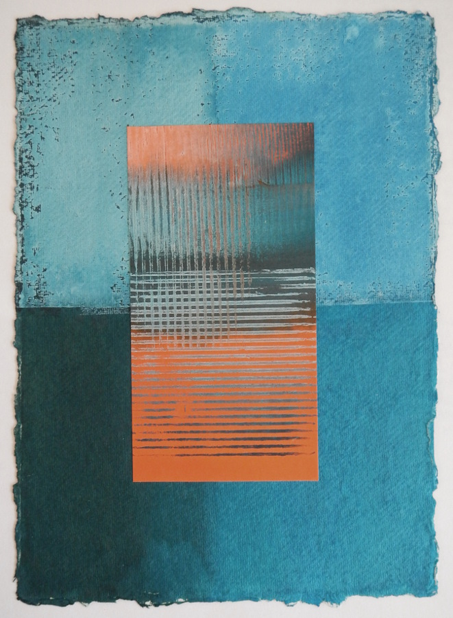
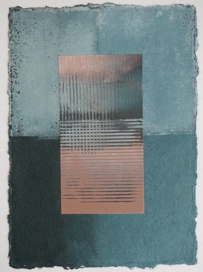
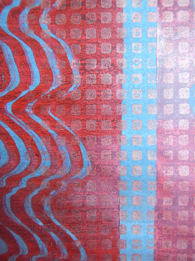
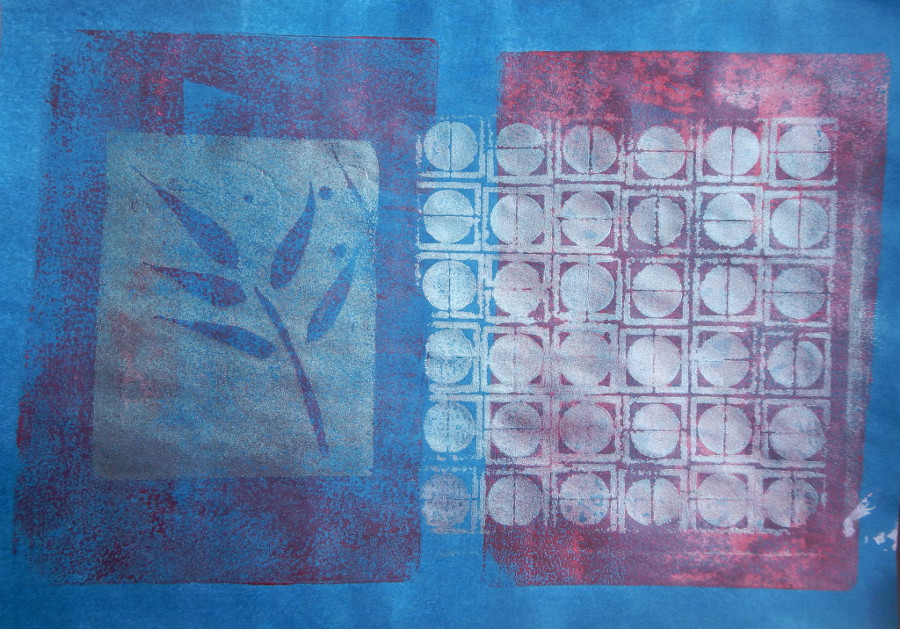
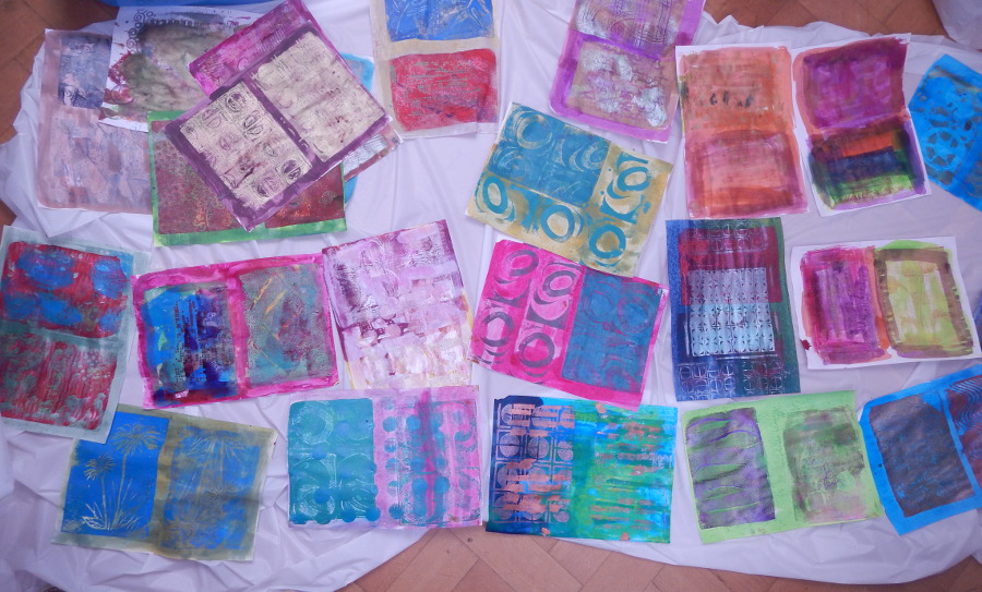
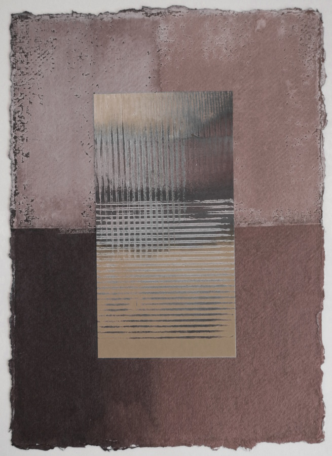
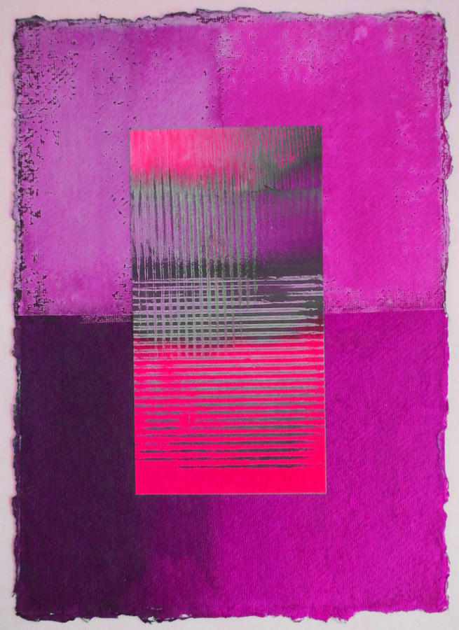
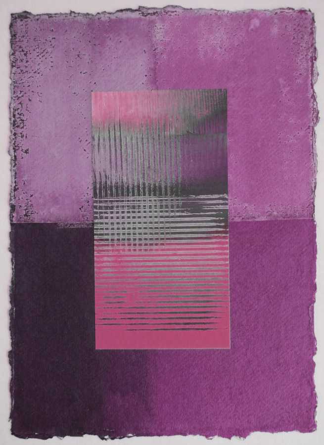
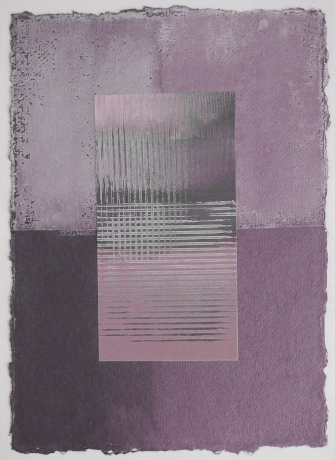
In these experiments, I used Gimp photo editing to alter the colour saturation in two stages, which as far as I can tell has a similar effect to adding both white and black simultaneously to paint or dye. In the pictures below I started with the original turquoise and orange print, but altered the colour balance first so that I could see the same process applied to different colour-ranges.
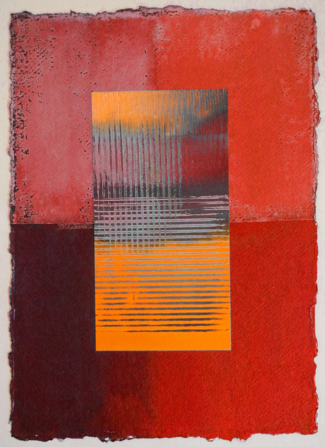
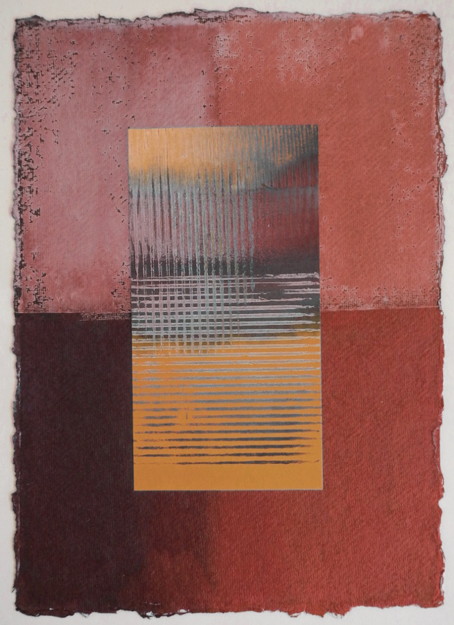
It starts to be apparent why the pure saturated colour-range in each of the left-hand photos doesn’t give such subtlety. Some might say vibrant or bold, others might say loud. The highly saturated colours on the left tend to be the ones that I normally choose.
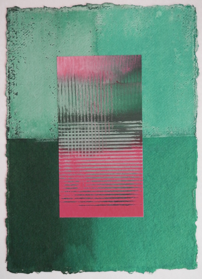
Looking at the reduced-saturation ones in the middle and right-hand photos, some might say they’re subtle or delicate, others might say bland. Colour is such a personal matter, and it has such an effect on us.
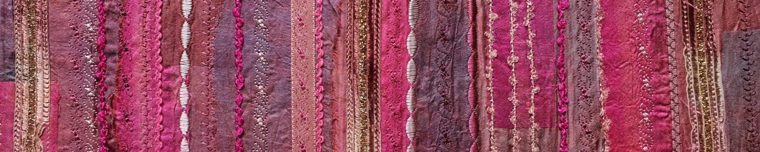
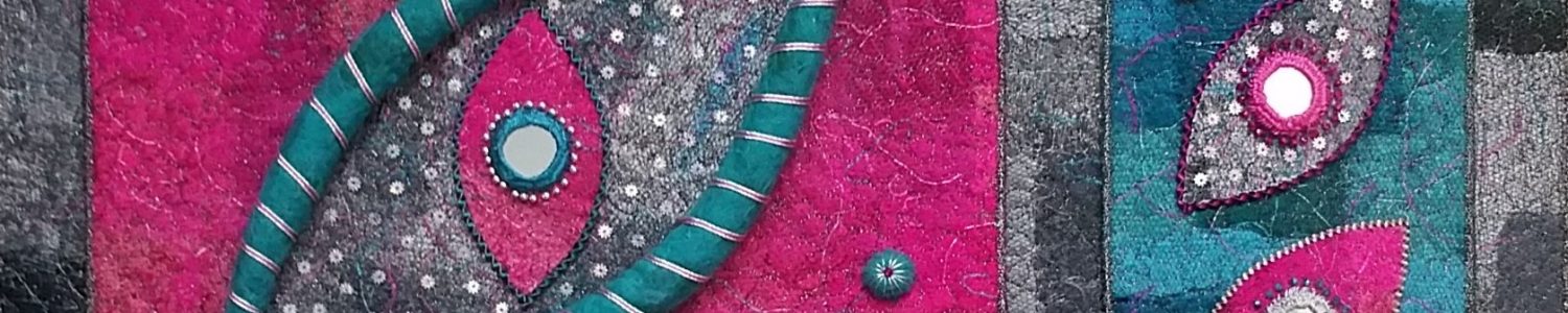
These experiments with colour are a first stage in thinking about stitched textile work based on Indian designs. The photos don’t look at all Indian, I know, but I plan to use Indian motifs in the stitching and to use contrasts in hue and saturation to create the impact of the piece. The idea at the moment is to use backgrounds that have variations in colour hue and saturation, with stitching that contrasts with those. In theory I may be able to create the effect of stitched areas that recede and advance depending on the background. Watch this space, as they say.